Reading: Introduction to Diversification
5. The Relevance of Correlation
To conclude this section, let us extend the considerations from before. Now that we know how to compute the risk and return of a portfolio, nothing can stop us from forming additional portfolios with different weights. That's exactly what the following graph does.
The green line shows the risk-return pattern when we move from 100% bonds (red dot) to 100% equities (blue dot). The green dot on this line marks the portfolio that we have computed before, i.e., 40% equities and 60% bonds.
As we can see, the risk-return profile improves substantially when we add a little bit of equities to a bond portfolio: Moving out of the bond portfolio, the risk initially drops even further while the return increases. Clearly, these portfolios are preferable to a pure bond portfolio, as the earn higher returns at a lower risk! At some point, the classical risk-return trade-off kicks in and additional returns can only be achieved with a higher risk.
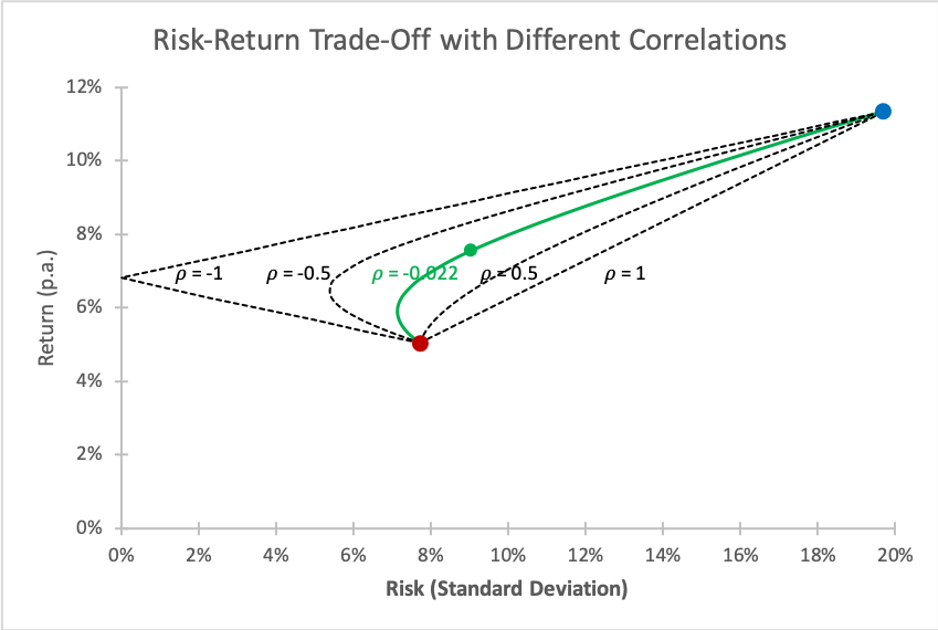
We can also use this graph to underpin the important role of the correlation. The dashed lines in the graph shows the risk-return pattern with different assumed correlations (from +1 to -1). Most notably:
- If the returns are perfectly positively correlated (\(\rho=1\)), there is no diversification potential. As a result, the risk-return trade-off assumes a linear function that connects the two portfolio constituents.
- In the other extreme, if returns are perfectly negatively correlated (\(\rho = -1\)), we have perfect diversification. We can completely eliminate the risk! In our example, that would be the case with an allocation of approximately 28% to equities and 72% to bonds.
When building portfolios, we are therefore ideally on the outlook for assets that have low correlations, as these assets offer the best diversification potential.